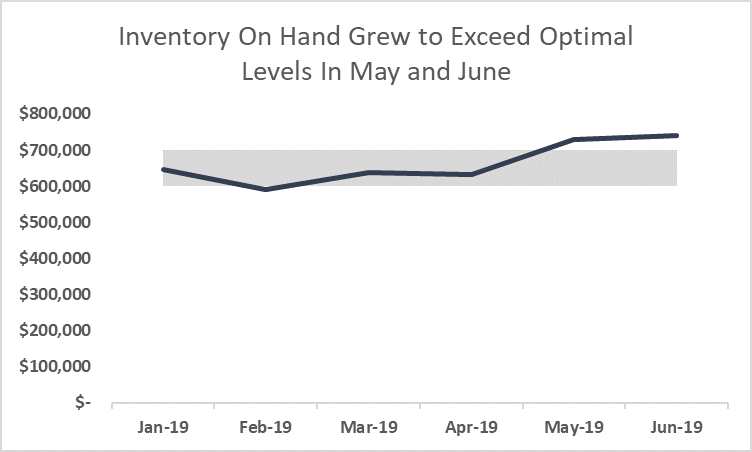
Adding Performance Bands to Charts
Many business professionals use charts when attempting to communicate more effectively. Unfortunately, these charts are not always as helpful as they should be. A common fault when creating a chart that illustrates trends is failing to put data in context. Fortunately, if you are building your charts in Excel, you can remedy this situation easily by adding performance bands to your charts.
What Are Performance Bands?
Performance bands are simply visualizations that identify acceptable boundaries for your data. Consider the data pictured in Figure 1 below. We would like to build a line chart in Excel to show the trend of the “Actuals” data in the table. However, we would also like to show the “Actuals” data in the context of the acceptable boundaries as identified by the “Lower Limit” and the “Upper Limit.”

Figure 1 – Data for Line Chart with Performance Bands
Creating Chart with Performance Bands
To achieve this, let us begin by modifying the data slightly. More specifically, we will create a new range of data which is shown in Figure 2. On the “Lower Limit” and “Actuals” rows of the new data range, cell references are used to link the data from that shown in Figure 1. However, the “Upper Limit” in the new data range is created with a formula that subtracts the values in the “Lower Limit” row from the values in the “Upper Limit” row. So, for example, the amount in cell B8 shown in Figure 2 is generated by the formula =B3-B2 referencing the data in Figure 1.

Figure 2 – Modified Data for Chart
With the modified data in place, we are ready to create the chart and the steps for doing so are outlined below.
- To begin, create a Stacked Area Chart using the modified data as the source.
- Right-click the Actuals series and change the Series Chart Type to a Line Chart without Markers.
- Right-click the Lower Limit data series and choose Format Data Series.
- Click Fill and select No Fill.
- Finally, address formatting options to suit your needs to complete the chart.
Upon doing the steps outlined above, your chart should resemble the one pictured in Figure 3.

Figure 3 – Displaying Actual Results Compared to a Range of Desired Performance
Summary
With the performance band in place, readers of your chart can understand the message you are conveying with this chart. Clearly, this customized chart is a more effective form of communication that a simple line chart that displays only inventory levels for the first six months of the year. Equally important, adding the performance band takes only a minute or two. Therefore, the next time you need to present data relative to a range of acceptable performance, consider adding a performance band to your chart.
You can see a video demonstration of this tip below.