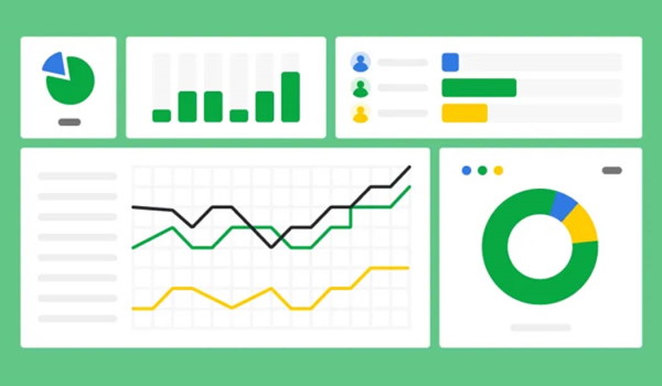
K2’s Excel Charting and Visualizations
Computer Software and Applications
4 CPE Credits

Major Topics
- Understanding the best types of visualizations to use in specific situations
- Creating compelling visualizations using Excel
- Adding interactivity to your Excel-based visualizations
Learning Objectives
- Identify the types of visualizations that you should use to communicate specific messages
- List the steps to creating compelling visualizations in Excel and other Microsoft Office applications
- Identify options for creating interactive visualizations
- Utilize Sparklines and Conditional Formatting to enhance visualizations in Excel
- Identify options for linking Excel-based data and visualizations into Word and PowerPoint
Description
Charts and graphs are nothing new. However, many professionals struggle with building compelling visualizations. If that statement describes you, participate in this session to improve your skills in creating Excel charts and other visualizations. As a result, you will create visualizations to enhance your communication skills.
This session is much more than just a seminar on fundamental charts. Instead, in this session, you will learn how to create advanced charts that are interactive, dynamic, and aesthetically pleasing – three qualities that will help to ensure that your readers and audience will understand the data you are presenting. This seminar is a must if you want to improve your communication skills.
Compliance Information
Overview
Charts and graphs are nothing new. However, many professionals struggle with building compelling visualizations. If that statement describes you, participate in this session to improve your skills in creating Excel charts and other visualizations. As a result, you will create visualizations to enhance your communication skills.
This session is much more than just a seminar on fundamental charts. Instead, in this session, you will learn how to create advanced charts that are interactive, dynamic, and aesthetically pleasing – three qualities that will help to ensure that your readers and audience will understand the data you are presenting. This seminar is a must if you want to improve your communication skills.
Course Details
- How Teams got to where it is today
- Major components in Teams
- Collaboration options
- Extending Teams functionality
- List examples of core functionality in Teams
- Identify new opportunities to improve Teams-based communications
- Specify how to integrate other services into Teams
- Name options for collaborating with internal and external Teams users
- List some of Teams most significant competitors
Intended Audience — Business professionals seeking to leverage Teams to a higher level
Advanced Preparation — None
Field of Study — Computer Software and Applications
Credits — 2 Credits
IRS Program Number –
Published Date – January 1, 2025
Revision Date –